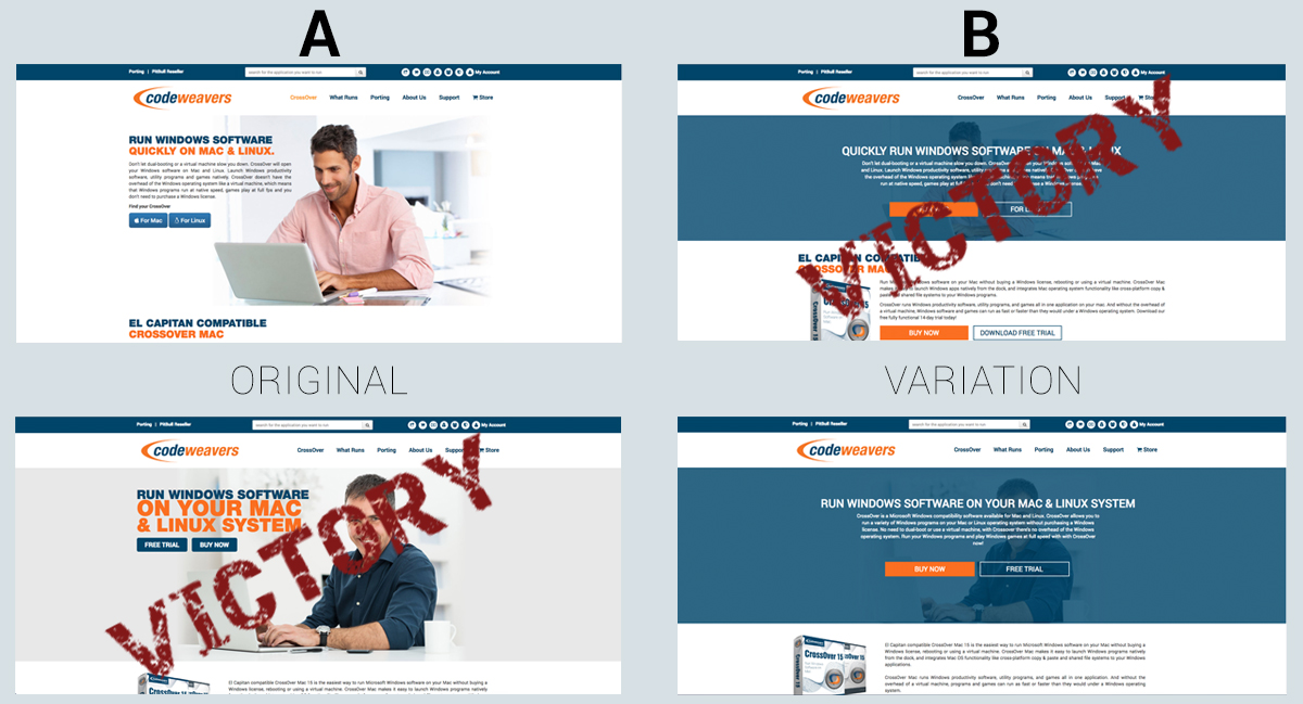
What’s giving marketing the blues this time of year when the sun is shining and the weather is sweet? Preliminary results of an A/B test we are running.
Marketing is no stranger to unexpected A/B test results, like last year when our testing revealed that men don’t like buying software
from women, in our blog post Selling Software, Sexist Google Data and what the actual Hell, Peopleelling Software, Sexist Google Data and what the actual Hell, People.
Luckily, the current head scratching data that has been presented to us isn’t of the sexist kind. It’s of the “that’s impossible sort.” Obviously not impossible, because it’s happening, but I have zero rhyme or reason as to why two converting pages on our website, when graphically treated similarly in an A/B test, compared to their original counterpart are displaying much different qualitative results.
Add a shade of blue they said (the voices in my head), it symbolizes trust, loyalty, wisdom, confidence, intelligence. Blue is considered
beneficial to the mind and body. It slows human metabolism and produces a calming effect they said (Google search of color psychology).
 So I added blue.
And ran two separate A/B tests on our homepage and on our products page, hypothesizing that the blue products page and the blue homepage would yield similar results. You know, perform better than the original or not. It simply did not occur to me (probably thanks to all the space the voices in my head were taking up) that the original design would be winning over the variation on one webpage, and on another webpage the variation would be winning over the original. Huh?!?
So the preliminary results for the products page, which has not budged in over a month now, says that the webpage with blue overlay [the variation] has a 94.6% probability of outperforming the original, while the homepage with the blue overlay has a 14.4% chance of outperforming the original.
What gives?
I could throw our crazy theories that only cephalopods, crustaceans, rabbits and squirrels were somehow randomly given the blue variation on our products page and since they only see blue and maybe one other color that is why it converted at a much higher rate than the original. Or I could argue that since our demographic is predominately male, and 8% of men (and 0.5% of women) are color blind, the blue variation played no part in their decision making process on our homepage. I could attest that our customers are optimists and the negative space (white space) on the original didn't jibe with their glass half full mentality, thus failing to make fruitful conversions. Or, I could go back to my marketing hut and stop the crazy conspiracy theories and simply rerun the test.
I’d like to hear from you. What do you think gives?
About Jana Schmid
Jana has been working in the marketing profession for over 15 years. She joined the CodeWeavers marketing department in 2010 and has earned oddities such as the Margaritaville Tahiti Frozen Concoction Maker and a lifetime supply of sparkling water for her performance as Marketing Director. Contact Jana at jana@codeweavers.com and learn more about her professional accomplishments on LinkedIn.

 Jana Schmid

