
CrossOver 22 is about multiplication! If only because 22 is… well, 11 x 2, and it is two twos (technically a palindrome)… it is about bounty… beauty and grace… but really…
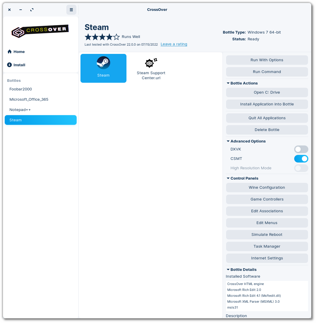
The hallmark of the CrossOver 22 release is a complete redesign of the user interface (now with twice as many cupholders) for macOS, Linux and ChromeOS. Before this redesign, the last time we made significant UI changes was in CrossOver 15, and the last time we did a major overhaul of our UI on all platforms was CrossOver 9. Clearly, we were overdue for a CrossOver makeover.
We designed the new UI with two goals (twice as many as the leading competitor1): to make CrossOver more intuitive to use and offer a more modern look and feel. We wanted it to be easy for our users to find the things they need to do most often and to bring the CrossOver interface in line with our branding.
Here’s an overview of the three big changes new to CrossOver 22:
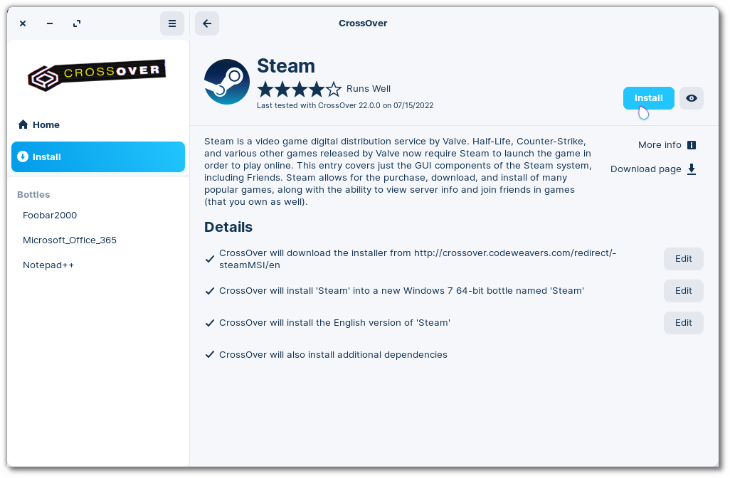
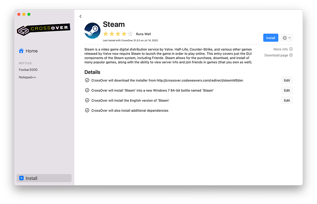
First, we made extensive changes to the installation process. Right away, you’ll notice that we updated the search functionality. Furthermore, CrossOver no longer uses a wizard format for installations. Instead, it uses defaults when possible and prompts you for the info you need to provide when necessary. Of course, you can override the defaults to customize your experience, such as choosing a different installer than the one CrossOver downloads automatically. All of this was designed to be easy for users who want to be guided through an install using default options and for users who like to tinker.
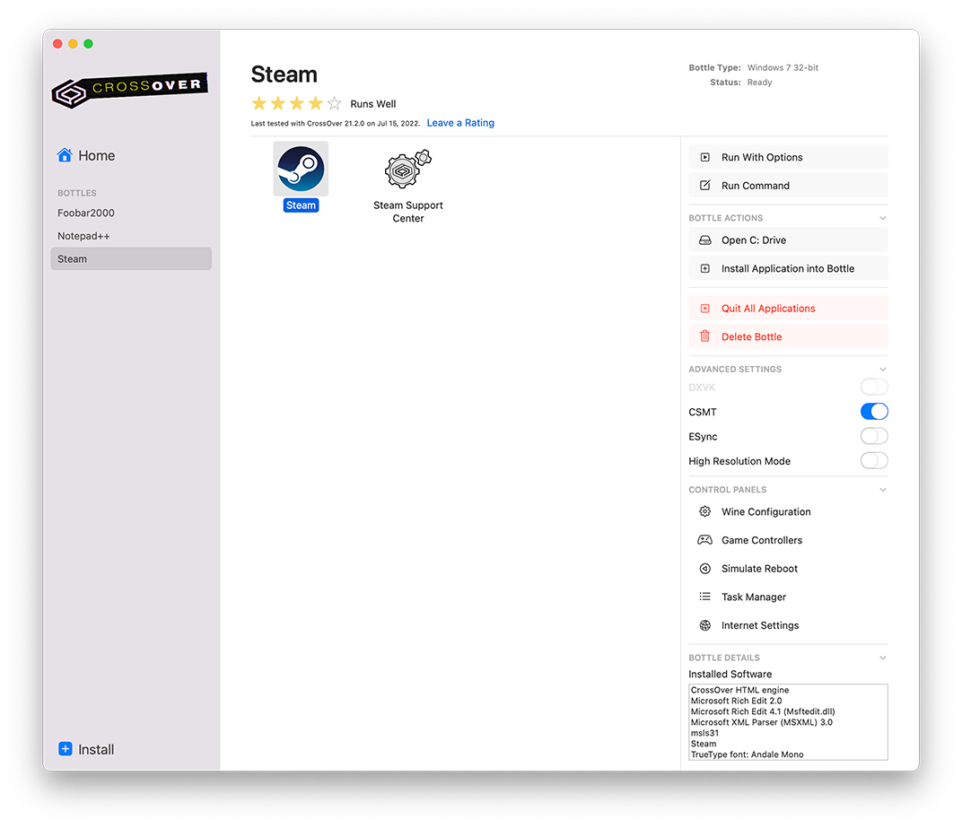
Second, we revamped the bottle view. While we made several tweaks here, the most prominent is the new right sidebar. The sidebar includes the most frequently used options accessible only via menus in CrossOver 21 and earlier. They’re all still available by menus, so let your muscle memory guide you if that's your thing. We also moved the Control Panels to the bottom of the right sidebar; they’re still accessible but don't dominate the bottle view like they used to.
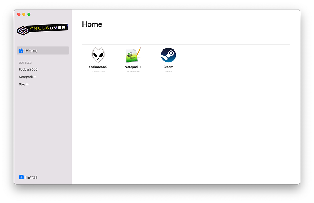
And third, we have a brand new “Home” view in CrossOver. It is a mash-up of the old “All Bottles” view and the old “Favorites” functionality. All launchers display by default in Home. If you only have a few apps installed and you want to be able to launch them from one place - great, use this view without modifications! If you have a lot of applications, or if your applications have some launchers that you never use, this view is now customizable! Just right-click to hide from Home. Changed your mind and want to add it back? Go to the bottle view and right-click to add to Home.
We're very grateful to our BetterTesters for providing feedback via surveys and usability studies. Now that we’ve released this new CrossOver design into the wild, we will be asking for feedback again soon. We hope you enjoy CrossOver 22!
And hey, I am not gonna do a deep dive to figure out the whys on this one, but CX11 was released in 2012. I mean, what were we thinking? Thank goodness CX22 is coming in hot in 2022.
1 Recent marketplace surveys indicated a preponderance of corporate entities undertaking projects with one goal. Our quantitative team checked the math on this. It has been confirmed that our two goals are twice that of the average competitor in the same or similar market spaces operating within the same economic headwinds.
About Meredith Johnson
Meredith has been with CodeWeavers since 2019, and currently wears both the QA Manager and CrossOver Product Manager hats. After getting her PhD in linguistics, she somehow stumbled into the Free and Open Source Software world. When she isn't testing CrossOver, she's probably perfecting yet another bean stew, jogging slowly, buying even more linen tunics, doing a face mask or doting on her perfect chunky baby.

 Meredith Johnson


